
Have you ever walked into a room and instantly felt calm, energized, or even a little uneasy? Thats the power of paint colour.
The colours on your walls do more than just “look good.” They affect how a room feels, its mood, its brightness, even its size. A cozy bedroom, a lively kitchen, or a relaxing bathroom all of that starts with choosing the right paint colour.
But picking the perfect colour for every room in your home isn’t that easy as it sounds. With hundreds of options and trendy names, it’s easy to feel lost.
That is why I created this room-by-room guide. I’ll help you understand:
- How different colours affect mood and space
- Which colours work best for each room
- Popular colour trends for 2025
- And some simple, practical tips to make sure you are happy with your choice, not just today, but for years to come.
Whether you are painting your home for the first time or giving it a fresh look, this guide will make it easy to choose paint colours with confidence.
Let’s get started one room at a time.
🖌️Understanding the Basics of Choosing Paint colours
Before jumping into room-by-room suggestions, it is important to understand a few basics that make up a solid interior paint colour guide.
These simple ideas can help you feel more confident about picking the best paint colours for every room in your home.
📚 Colour Theory Made Simple
Let’s start with the colour wheel. Imagine a circle of colours, that’s it. It shows how colours relate to each other and helps you create beautiful paint colour combinations.
- Primary colours: Red, blue, and yellow. These are the base colours. All other colours come from mixing these.
- Secondary colours: Green, orange, and purple. These are made by mixing two primary colours.
- Tertiary colours: These are mixes of a primary and a secondary colour, like teal or amber.
Understanding this helps you see how colours work together.
For example: colours opposite each other on the wheel (like blue and orange) are called complementary colours, they create contrast and energy when paired.
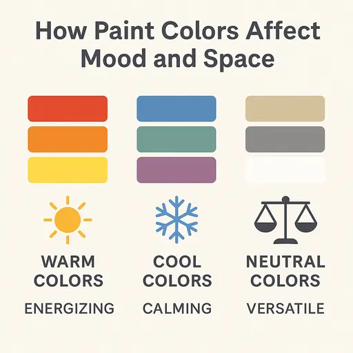
🌡️ Warm, Cool, and Neutral colours
- Warm Paint colours: Think red, orange, and yellow.
These colours feel energetic, cozy, and welcoming. Perfect for social areas like the living room or dining room. - Cool Paint colours: Think blue, green, and purple.
These give off a calm, peaceful vibe. Great for bedrooms, bathrooms, or study areas where you want to feel relaxed. - Neutral Paint colours: colours like white, gray, beige, and greige (a mix of gray and beige). These are timeless and flexible.
Neutrals are often used as base colours or backdrops, you can easily add bold colours as accents later.
These colour types help you choose the right feeling for each space like a key part of colour psychology in rooms.
🔆 How to Choose Paint colours Based on Light
Light changes everything. A colour might look amazing in the store but completely different on your wall at home. That’s because paint reacts to light.
- Natural Light
Sunlight can make colours look brighter and more yellow during the day. North-facing rooms get cooler light; south-facing ones get warmer tones. - Artificial Light
Bulbs can add yellow, white, or even blue tones to your walls. Warm lights can make cool colours look dull, while cool lights can make warm colours feel too sharp.
Paint colour selection tips: Always test a few paint swatches directly on your wall. Look at them during the morning, afternoon, and evening. You wll notice how the shade changes.
📐 Room Size and Shape Matters
Did you know that room paint colours can actually change how big or small your space feels?
- Light colours: Make a room feel bigger, brighter, and more open. Great for small rooms or low ceilings.
- Dark colours: Make a room feel cozy and close. Great for large rooms you want to feel more inviting.
If your room is narrow or oddly shaped, paint can help balance things out like using a darker colour on one wall to make it feel closer.
🪑 Use Your Furniture and Decor as a Guide
Your couch, curtains, floors, or even a favorite painting can help you decide your colour scheme for rooms.
Instead of starting from scratch, look around the room and find colours that already exist. Then pick a wall colour that matches or complements them.
🧘 The Mood You Want to Create
Every room should “feel right.” Thats where colour psychology in interior design comes in:
- Want energy and fun in your kitchen? Try warm yellows or soft reds.
- Need peace and calm in your bedroom? Go for cool blues or greens.
- Hoping for balance in your home office? Neutrals or light greens work great.
Paint isn’t just decoration. It sets the mood. So think about how you want to feel in each space. Then pick your colours based on that.
🖌️🎨 Choosing Paint Colours by Room
Now that you know the basics of how colours work, lets walk through each room of the house.
You will see how to choose paint colours that not only look good but also feel right. Just by using simple ideas based on mood, purpose, and space.
This is where your interior paint colour guide really comes to life.
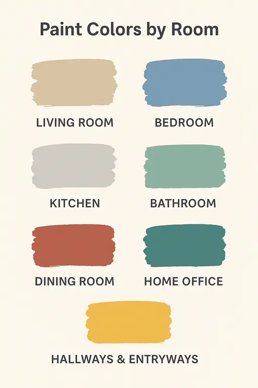
🛋️ Living Room Paint Colours: Welcoming and Comfortable
The living room is where life happens. Whether its chatting with guests, watching a movie, or relaxing with family. So the goal here is warmth, comfort, and a touch of style.
Popular living room paint colour ideas:
- Neutrals like soft beige, greige, or creamy white create a calm, versatile background.
- Warm grays offer a modern look without feeling cold.
- Cool blues and earthy greens add peace and balance while still feeling cozy.
💡 Paint colour selection tip:
If you have an open plan living area, choose a colour that connects smoothly with the kitchen or dining space to create flow.
Neutral paint colours work great as a base, with bold colours used for an accent wall or decor.
🛏️ Bedroom Paint Colours: Relaxation and Rest
Your bedroom should be your peaceful escape. a place to slow down, rest, and recharge.
Best paint colours for bedrooms:
- Calming blues (like sky blue or slate blue) help relax the mind.
- Soft greens feel fresh and soothing.
- Light neutrals like ivory, taupe, or pale gray give a clean, cozy look.
Avoid bold reds or very dark colours unless you are creating a dramatic style and even then, use them carefully.
colour psychology in rooms tells us that soft, cool colours help lower stress and promote sleep. So keep it gentle in your bedroom.
🍳 Kitchen Paint Colours: Energy Meets Function
The kitchen is both a working space and a social spot. It needs to feel clean but also lively.
Popular kitchen paint colours:
- White for a clean, bright, and timeless look especially if your kitchen is small.
- Gray or greige for a soft modern feel.
- Pale blues and fresh greens for calmness.
- Warm tones like light yellow or terracotta can bring energy and warmth, great for morning light.
Don’t forget your cabinets and countertops. If they are bold or busy, choose softer wall colours. If they are simple, you can play more with bolder wall tones.
🛁 Bathroom Paint Colours: Spa or Bold?
Bathrooms are a fun place to experiment with paint. You can go calm or dramatic depending on the size and your style.
Popular bathroom paint colours:
- Soft blues and seafoam greens for a spa like, refreshing feel.
- Clean whites or light grays keep things simple and bright.
- Bold colours like navy, teal, or charcoal work well in small powder rooms to make a big statement.
Paint colour trends 2025 include soft blush tones and muted green grays for a nature inspired look that feels fresh and modern.
🍽️ Dining Room Paint Colours: Set the Mood
The dining room is where people come together for meals, talks, and laughter.
The right colour can make it feel warm and welcoming or elegant and cozy.
Best dining room paint colours:
- Warm tones like deep red, burnt orange, or rich browns spark energy and conversation.
- Jewel tones like navy or emerald create drama and intimacy.
- Neutral colours with a bold accent wall can balance calm and style.
🍷 Want to make the space feel more formal? Go with darker shades. Want it airy and bright? Choose light neutrals and soft colour accents.
💻 Home Office Paint Colours: Focus and Calm
If you are working from home, a peaceful and productive home office matters more than ever.
Paint colours that promote focus:
- Soft blues and dusty greens improve concentration and calm.
- Neutral tones like light beige or taupe are not distracting and keep the mind clear.
- Avoid overly bright colours, which can be energizing but also overstimulating.
🌿 Add a plant or some natural textures your office will feel grounded and inspiring.
🚪 Hallways & Entryways: First Impressions Matter
These often overlooked spaces set the tone for your entire home. They should feel inviting and connected to the rest of the house.
Popular hallway and entryway colours:
- Light neutrals like off-white, pale gray, or sand are great for small or narrow spaces.
- Bolder colours like olive, navy, or terracotta can make a memorable entrance if the space has good lighting.
- Accent wall colours or a painted door can add personality without overpowering.
✨ Choosing paint colours for home is not just about the main rooms but also the small spaces deserve attention too!
Advanced Techniques and Considerations
Now that you know how to choose paint colours for each room. Lets take it a step further.
These advanced tips will help you feel even more confident like you are not just picking colours but also designing your dream space with thought and purpose.
🧠 Using Colour Psychology in Rooms
colour psychology helps us understand how colours affect the way we feel, think, and behave. Each colour sends a message and brings a mood with it.
Here is how to apply colour psychology in interior design:
🔵 Blue: Calming, lowers stress. Great for bedrooms, bathrooms, or offices.
🟢 Green: Refreshing and natural. Ideal for kitchens, living rooms, or bedrooms.
🟡 Yellow: Cheerful and warm but too much can feel overwhelming. Use in kitchens or accents.
🔴 Red: Bold and energetic. Can raise excitement. Use in dining rooms or as an accent.
🟣 Purple: Creative and luxurious. Works well in bedrooms or reading spaces.
⚪ Neutral paint colours (gray, beige, white): Versatile and timeless. These support other colours and bring balance.
Pro tip: Think about what you do in each room and how you want to feel. Then choose paint colours that match that feeling.
🎯 Creating Paint Colour Combinations and colour Schemes
Choosing one good colour is great but knowing how to combine colours can take your space to the next level.
Here are three basic colour schemes for rooms:
Monochromatic: One colour in different shades (like light blue, medium blue, navy). Clean and calm.
Analogous: colours next to each other on the colour wheel (like blue, teal, green). Harmonious and easy on the eyes.
Complementary: colours opposite each other (like blue and orange). Bold, exciting, and high contrast.
🧩 Use the 60-30-10 Rule:
60% main colour (walls)
30% secondary colour (furniture, curtains)
10% accent colour (pillows, decor)
This simple rule keeps your colour palette balanced and beautiful.
🖼️ The Power of an Accent Wall
An accent wall is a single wall painted a different colour to stand out and it can totally transform a space.
When and where to use an accent wall:
- Behind a bed in the bedroom.
- The wall with a fireplace or TV in the living room.
- The dining wall behind a table.
Best accent wall colours:
- Deep blues, forest green, terracotta, charcoal.
- Try bold colours only on one wall to avoid overwhelming the space.
Accent walls help you enjoy colour without fully committing to it everywhere. They are great for style and depth.
✨ Considering Paint Sheen
The finish or sheen of the paint changes how it looks and performs. It also helps protect walls based on how much traffic the room gets.
Here are the main types of paint sheen and where to use them:
- Flat or matte: No shine. Hides wall flaws. Great for ceilings and bedrooms.
- Eggshell: Soft, low sheen. Easy to clean. Good for living rooms and hallways.
- Satin: Smooth and slightly shiny. Works well in kitchens, bathrooms, and kids’ rooms.
- Semi-gloss: More shine. Moisture-resistant. Perfect for trim, doors, kitchens, and bathrooms.
- High gloss: Very shiny and tough. Best for furniture, cabinets, and accents, not entire walls.
Paint colour combinations may also look different depending on the sheen, so always test them together.
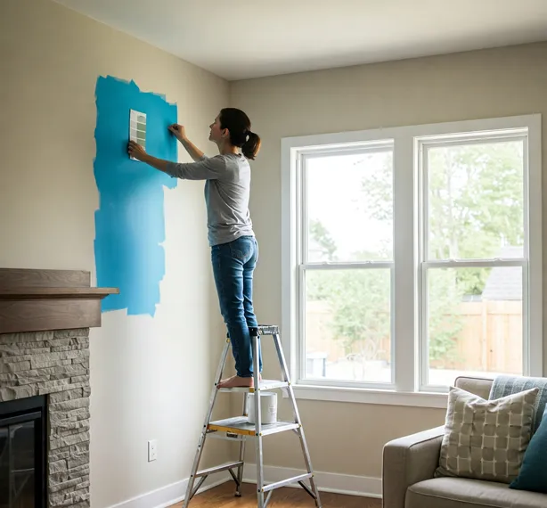
🧪 Testing Paint Colours
Never skip this step. What looks perfect in the store might look totally different on your wall.
Why testing is important:
- Lighting, wall texture, and even nearby furniture affect how colour appears.
- Morning and evening light can change a colour’s tone.
How to test paint samples effectively:
- Get sample pots or peel and stick swatches of your chosen colours.
- Paint large patches (about 2×2 feet) on different walls.
- Watch how the colour looks throughout the day. in sunlight, evening light, and artificial light.
- See how it looks with your furniture, curtains, or flooring.
🎯 Tip: Test a few room specific paint colours side by side to choose what feels best in your space not just what is trending.
🔝 Paint Colour Trends 2025 & Inspiration Boards
Choosing the right paint colours for each room isn’t just about personal preference. It’s also about staying informed on current trends that can enhance your homes appeal.
Let us explore the top interior paint colour trends for 2025 and how you can incorporate them into your living spaces.
🌿 Embracing Earthy Tones
In 2025, there is a noticeable shift towards earthy tones that bring warmth and a connection to nature into our homes.
These colours create a calming and inviting atmosphere, perfect for any room.
Trending earthy shades include:
- Terracotta and Warm Beige: These hues offer a cozy and timeless appeal, making spaces feel grounded and welcoming.
- Moss Green and Olive: Inspired by nature, these greens evoke tranquility and a sense of the outdoors.
- Cinnamon Slate: A delicate mix of heathered plum and velvety brown, this colour brings a smooth familiarity to any design.
💛 The Rise of Muted Yellows
Yellow is making a cheerful comeback in 2025, with designers favoring softer, grounded shades that add warmth without overwhelmig a space.
Popular muted yellows:
- Convivial Yellow: A sophisticated shade that infuses spaces with energy and positivity.
- Butter: A sunny alternative to simple whites, offering versatility and an uplifting ambiance.
💎 Incorporating Jewel Tones
For those looking to make a bold statement, jewel tones are gaining popularity.
These rich, saturated colours add depth and luxury to interiors.
Notable jewel tones:
- Deep Blues and Burgundy: These shades offer a sophisticated and warming effect, perfect for creating moody, statement making spaces.
- Stained Glass: A captivating hue that brings a touch of elegance and complexity to any room.
🖼️ Creating Your Inspiration Board
To visualize how these trends can come together in your home, consider creating an inspiration board:
- Gather Samples: Collect paint swatches, fabric samples, and images of rooms that resonate with your desired aesthetic.
- Mix and Match: Experiment with different combinations of colours and textures to see what appeals to you.
- Consider Lighting: Observe how your chosen colours look under various lighting conditions throughout the day.
- Personalize: Incorporate elements that reflect your personality and lifestyle to ensure your space feels uniquely yours.
By thoughtfully selecting colours that align with both current trends and your personal style, you can create a harmonious and inviting home environment.
Exterior – Choosing Outer Wall Paints for Elevation
The first thing you will admire is the elevation and outer colours. Also when someone passes by your home or comes to visit, the first thing they notice is the outside.
That is why choosing the right outer wall paint is just as important as what you pick inside.
A good exterior paint colour not only makes your home look beautiful but also protects it from the weather.
Why Exterior Paint Colours Matter
1. First Impressions
Your home’s outside is its face to the world. Whether you’re planning to stay long term or thinking about resale in the future, well-chosen exterior colours can make your home feel inviting, cared for, and attractive.
2. Protection from Weather
Paint isn’t just for beauty it also acts like a shield. A high quality exterior paint helps protect walls from sun, rain, dust, and even mold.
Choosing the right type and shade can make your walls last longer and look fresh year round.
🧠 What Affects Your Exterior Colour Choice?
Before you grab a colour card or rush to the paint shop, here are a few important things to think about:
1. Style of Your Home
Is your house modern, traditional, colonial, or cottage-style?
- Modern homes often look great in cool tones like gray, white, or navy.
- Traditional or classic homes pair well with beige, earthy tones, or soft pastels.
2. Surroundings and Landscape
Take a look around your house.
- Do you have lots of greenery? Earthy tones like olive, taupe, or brown can blend beutifully.
- Is your home near the beach or in a dry, sunny area? Lighter tones may work better to match the natural setting.
3. Climate and Sunlight
- Hot, sunny areas: Light colours reflect heat, helping keep your home cooler.
- Cooler places: Darker shades can absorb warmth and create a cozy look.
4. Neighborhood Look
- If you are planning to stand out. Check you neighborhood and select wisely. Pick a colour that doesn’t clash with your neighbors homes.
- If you are living in a gated community or an area with a homeowner’s association (HOA), check for colour guidelines. Some places have rules to maintain a uniform look across homes.
🎨 How to Choose the Right Exterior Paint Colours
A good exterior colour scheme usually includes:
- Main colour – the dominant colour of your house.
- Trim colour – used on edges like window frames, doors, and roof borders.
- Accent colour – for highlights like your front door, shutters, or railings.
🔹 Example Combo:
- Main colour: Warm gray
- Trim: White
- Accent: Navy blue
Think of this like dressing up your house. The main colour is the outfit, trim is the accessories, and accent colours are your statement pieces.
🌟 Popular Outer Wall Paint Colour Ideas
Let’s look at some tried and true choices that work well for many homes:
1. Neutrals
Timeless and always in trend. Think of colours like beige, off white, greige (gray + beige), or stone. These are easy to match with any trim or roof and work in almost any location.
2. Blues and Grays
Modern and sleek. These give a clean, elegant look. Lighter blues can feel fresh and coastal, while darker grays give a bold, classy appearance.
3. Earthy Tones
Perfect if you want your house to blend into a natural setting. Terracotta, moss green, tan, or chocolate brown bring a grounded, calming feel.
4. Bolder colours
Want to stand out? Deep navy, burgundy, or even forest green can make a statement. Just be careful not to go overboard balance it with neutral trims to keep things elegant.
✅ Quick Tips Before You Paint
Always test your paint on a small section first. colours can look very different in outdoor light compared to a paint card.
- Check during different times of day – morning, noon, evening to see how light changes the look.
- Match with roof colour – Your roof is a big visual part of your house. Make sure your wall colours do not clash with it.
- When you choose the right outer wall paint, you are not just painting a building, you are creating a welcoming home that feels right every time you pull into the driveway.
Let your house shine with colours that match your taste and stand the test of time.
Popular Paint Brands: Asian Paints, Nippon Paint, and More
When it comes to painting your home, the brand of paint you choose matters just as much as the colour.
A high quality paint brand can make the difference between a smooth, long lasting finish and a paint job that fades or peels too quickly.
Good brands offer better coverage, richer colours, longer durability, and protection from moisture, dirt, and weather.
Let’s take a look at two of the most trusted paint brands in India. Asian Paints and Nippon Paint, along with a few others you might want to consider.
🏆 Asian Paints
Asian Paints is one of the most well-known and trusted paint companies in India. Chances are, if you’ve asked someone about painting their home, they’ve probably used Asian Paints at least once.
Why Homeowners Love It:
- Wide range of products for both interior and exterior walls.
- Known for smooth application, rich colour choices, and long lasting finishes.
- Offers everything from budget friendly to premium options.
Popular Product Lines:
- Royale Luxury Emulsion – Perfect for interiors with a luxurious silky finish.
- Apex Ultima – Great for exterior walls, weatherproof and fade resistant.
- Tractor Emulsion – Budget friendly, good for rental or touch up jobs.
Asian Paints also offers tools like colour Visualizer and home consultations to help you choose the best colour and product.
🎯 Nippon Paint
Nippon Paint, originally from Japan, has been gaining popularity in India for its eco friendly, low odor, and high quality paint solutions.
What Sets Nippon Apart:
- Focus on green technology and low VOC (Volatile Organic Compounds) paints.
- Offers a range of anti bacterial and washable paints.
- colours are rich and vibrant, with a smooth finish.
Popular Product Lines:
- Nippon Odour less AirCare – Ideal for bedrooms and homes with kids, as it reduces indoor air pollution.
- Nippon Weatherbond Pro – Designed for long lasting exterior protection in harsh weather.
- Nippon Satin Glo+ – For a rich satin like sheen on interior walls.
If you care about air quality and environmental impact, Nippon is a great choice.
🛍️ Other Paint Brands to Consider
Besides Asian Paints and Nippon, there are several other reputable paint brands in the market:
- Berger Paints – Known for quality and a broad selection of colours and finishes.
- Dulux – Offers premium international colour palettes and durable products.
- Indigo Paints – An emerging brand with innovative features like dirt proof and heat reflective paints.
Each brand has its strengths, so it’s worth comparing based on your budget and preferences.
🧪 Choosing the Right Paint Product
No matter which brand you choose, it’s important to understand the type of paint and finish that suits your needs:
🖌️ Paint Types:
- Emulsion Paints – Water based, ideal for interiors. Easy to apply, quick drying, and low in odor.
- Enamel Paints – Oil based, suitable for wood, metal, and areas that need a tough, washable surface.
- Distemper – Economical option, but less durable and not as smooth as emulsions.
🌟 Paint Finishes:
- Matte Finish – Non-reflective, hides wall imperfections well.
- Eggshell/Satin Finish – Slight sheen, easy to clean, good for living rooms or hallways.
- Silk/Luxury Finish – High end, smooth, and elegant. Perfect for showpiece walls.
- Semi Gloss and Glossy – Shiny and durable, often used for doors, windows, and trims.
👉 Pro Tip: For high usable areas (like kitchens or hallways), choose washable or stain resistant paints.
Choosing a reliable paint brand gives you peace of mind. It ensures your walls stay beautiful and protected for years.
Whether you go with Asian Paints for its variety and ease, Nippon Paint for its eco-conscious innovation, or explore other trusted brands, always test the colour and choose the right finish for each rooms function.
Let your home shine both inside and out with the right products from the best brands!
Summary – Bringing Your Home to Life with the Right Paint colours
Choosing paint colours for your home might seem overwhelming at first, but when you take it step by step, it becomes a creative and even enjoyable process.
Let’s quickly go over what we’ve learned:
✅ Start with the basics – Understand warm, cool, and neutral tones, and how they affect the mood of a room.
✅ Consider each rooms purpose – A bedroom needs calm, a kitchen may need energy, and a home office should help you focus.
✅ Factor in light, room size, and existing decor – These influence how a colour will truly look on your walls.
✅ Use colour psychology and smart colour combinations – Play with the 60-30-10 rule, explore accent walls, and choose the right sheen.
✅ Look at current trends, but stay true to your style – Earthy tones, blues, and warm neutrals are in, but your space should reflect you.
✅ Don’t forget the outside – Your exterior paint plays a big role in first impressions and protection from the elements.
✅ Choose quality paint brands – Like Asian Paints or Nippon Paint to ensure lasting beauty and durability.
🌟 Be Bold and Trust Your Instinct
Remember, there are no fixed rules when it comes to choosing paint colours for your home.
Every home is unique. Every family is different. While guides like this help steer you in the right direction, its your instinct and comfort that matter the most.
If a colour makes you feel happy, relaxed, or energized in the space you want it to it is the right one for you.
So go ahead and test those samples. Try bold ideas and most of all have fun with it. After all your home should look and feel exactly the way you want it to.